Archived topic
Checkout styling
3 replies · Started by ustar on November 6, 2019
Viewing posts 1–4 of 4
Hi, there!
Is it possible to make delivery options in one column on the checkout page? As if more compact. Now it looks a little strange, especially on small screens (for example, iPhone 5).
https://i.postimg.cc/pV7Tqg2L/2019-08-08-8-45-36.png
https://i.postimg.cc/xdtjHZxY/2019-08-08-8-45-54.png
https://i.postimg.cc/NMngCHvz/2019-08-08-8-46-10.png
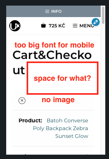
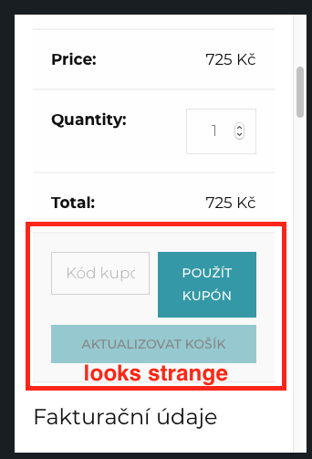
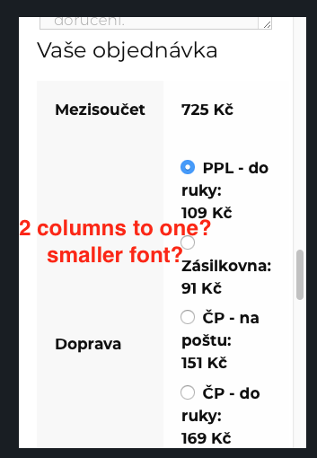
For better understanding you could take a look on the live site u-star.cz
Thanks for your help!
Regards, Sergey.
Hi there,
try this CSS:
@media (max-width: 768px) {

    /* reduce space between cart title and content */
    .woocommerce-checkout .entry-content {
        margin-top: 0.5em;
    }

    /* Display thumbnail align right of remove button */
    .woocommerce-page table.cart .product-thumbnail {
        display: block !important;
    }

    .woocommerce-page table.cart .product-thumbnail:before {
        display: none;
    }

    .woocommerce-page table.cart .product-remove {
        float: left;
        border-bottom: 0;
    }

    /* Force inputs to stack */
    .woocommerce #content table.cart td.actions .coupon .button,
    .woocommerce #content table.cart td.actions .coupon .input-text,
    .woocommerce #content table.cart td.actions .coupon input,
    .woocommerce table.cart td.actions .coupon .button,
    .woocommerce table.cart td.actions .coupon .input-text,
    .woocommerce table.cart td.actions .coupon input,
    .woocommerce-page #content table.cart td.actions .coupon .button,
    .woocommerce-page #content table.cart td.actions .coupon .input-text,
    .woocommerce-page #content table.cart td.actions .coupon input,
    .woocommerce-page table.cart td.actions .coupon .button,
    .woocommerce-page table.cart td.actions .coupon .input-text,
    .woocommerce-page table.cart td.actions .coupon input {
        width: 100%;
    }

    /* Stack Tables */
    .woocommerce table.shop_table tfoot th,
    .woocommerce table.shop_table tfoot td {
        display: block;
        width: 100%;
    }

}Hi, David!
Tnank you! Much better!
Regards, Sergey.
You're welcome
This archived topic is closed to new replies.