
Archived topic
Automatic width alignment of menu items
6 replies · Started by Ceramica Sud Curlante on November 19, 2021
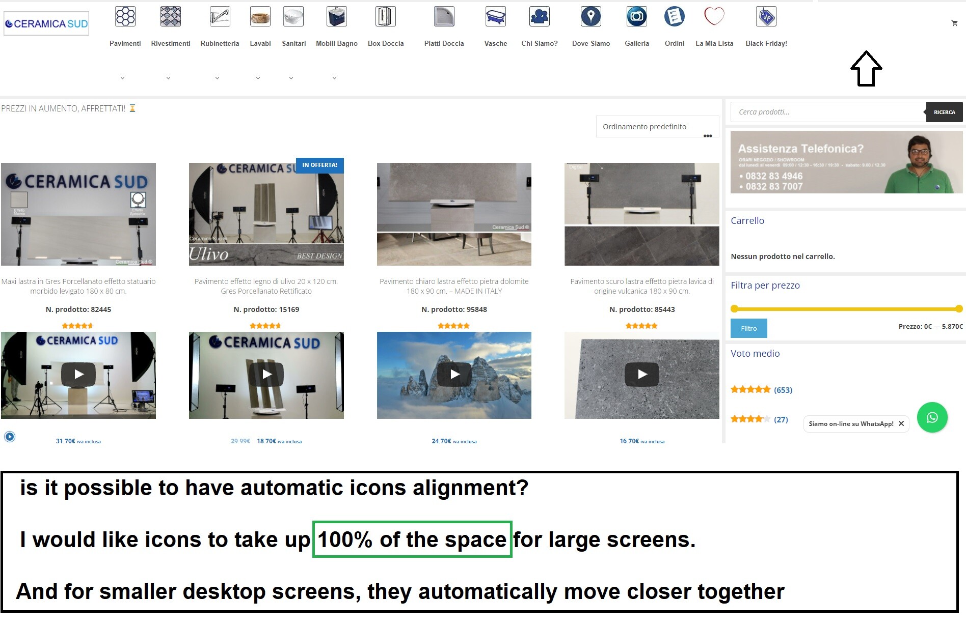
Ask if it is possible to align the width of the menu items to 100%.
I tried to insert some css by myself, but I couldn't.
I attach photos:
Hi there,
try this CSS:
@media(min-width: 1700px) {
    .main-navigation .main-nav>ul {
        display: flex;
    }

    .main-navigation .main-nav>ul>li {
        flex: 1;
    }

    .main-navigation .main-nav>ul>li>a {
        padding-left: 0 !important;
    }
}I entered the code but unfortunately it doesn't work.
I am attaching all the codes that I have entered, perhaps there is a conflict:
- Additional CSS:
.main-nav > ul > li.menu-item >a {
display: flex;
flex-direction: column;
align-items: center;
}
.main-nav > ul > li > a >font {
font-size: 10px;
}
.main-nav > ul > li > a > img {
height: 40px;
width: 40px;
}
.mobile-header-sticky #mobile-header.toggled .main-nav>ul {
display: flex;
flex-wrap: wrap;
}
.mobile-header-sticky #mobile-header.toggled .main-nav>ul>li {
width: 30%;
}
body .main-navigation.has-branding .inside-navigation {
align-items: flex-start;
}
.woocommerce div.product div.images img {
height: 100%;
width: auto;
margin-left: auto;
margin-right: auto;
}
@media (max-width:768px){
.main-navigation .main-nav ul li a {
padding: 0 !important;
}
ul#menu-menu-1 {
width: 100%;
}
ul#menu-menu-1 {
justify-content: center;
}
.woocommerce div.product img { height: auto !important; }
body .main-navigation.has-branding .inside-navigation {
width: 100%;
}
@media(min-width: 1700px) {
.main-navigation .main-nav>ul {
display: flex;
}
.main-navigation .main-nav>ul>li {
flex: 1;
}
.main-navigation .main-nav>ul>li>a {
padding-left: 0 !important;
}
}
The CSS should work, I don't see it's been added to your site, have you cleared cache after the changes are made?
Let me know :)
I entered "important!" in all 3 lines of code and it works ...
Tell me if it's okay and I can leave the code with this change.
It seems to me that it works fine now.
-------------------------------------
@media(min-width: 1700px) {
.main-navigation .main-nav>ul {
display: flex !important;
}
.main-navigation .main-nav>ul>li {
flex: 1 !important;
}
.main-navigation .main-nav>ul>li>a {
padding-left: 0 !important;
}
}
So seems the original CSS would be overridden by other existing CSS.
You can use important, although would recommend using more specific selector instead using important.